Imagine walking into a room and instantly feeling calm, energized, or maybe a little restless—and you can't quite explain why. Often, it’s not the furniture or the lighting. It’s the walls. The color that surrounds you, often passively, has a very active relationship with your brain.
Color is not decoration. It’s communication. And when it comes to your living space, what your walls “say” can shape how you feel, think, and interact. So, choosing a wall color isn’t just a design choice—it’s a psychological one.
Let’s Talk Blue: The Brain’s Favorite Background Noise
Blue is that friend who never overtalks at dinner. Calm, collected, and endlessly versatile, blue is one of the safest bets when you’re aiming for serenity. That’s why it's a top pick for bedrooms, bathrooms, and offices. Not to mention, studies show it can lower blood pressure and heart rate. So yes, your walls can help you chill—literally.
But not all blues are equal. A deep navy may feel rich and moody, even a little introspective, while a pale powder blue whispers coastal breeze and freshly laundered sheets. Use with intention. If your space already leans cool in terms of lighting or decor, too much blue can tilt into cold and uninviting territory.
Sunny-Side Up: Yellow’s Complicated Mood
Yellow is often called the “happy” color, and it makes sense—it's the color of sunshine, of daffodils, of lemon pie in the summertime. It perks us up. But here’s where it gets tricky: too much yellow can tip into irritation. Babies, oddly enough, cry more in yellow rooms. Adults, too, might find a bright yellow kitchen a little overstimulating after the first cup of coffee.
The fix? Think of yellow as a seasoning. A soft buttery tone in a breakfast nook feels like a hug. A bold marigold in a hallway can energize the in-between spaces. But painting your whole living room banana-bright? You might find yourself shouting at the TV more than usual.
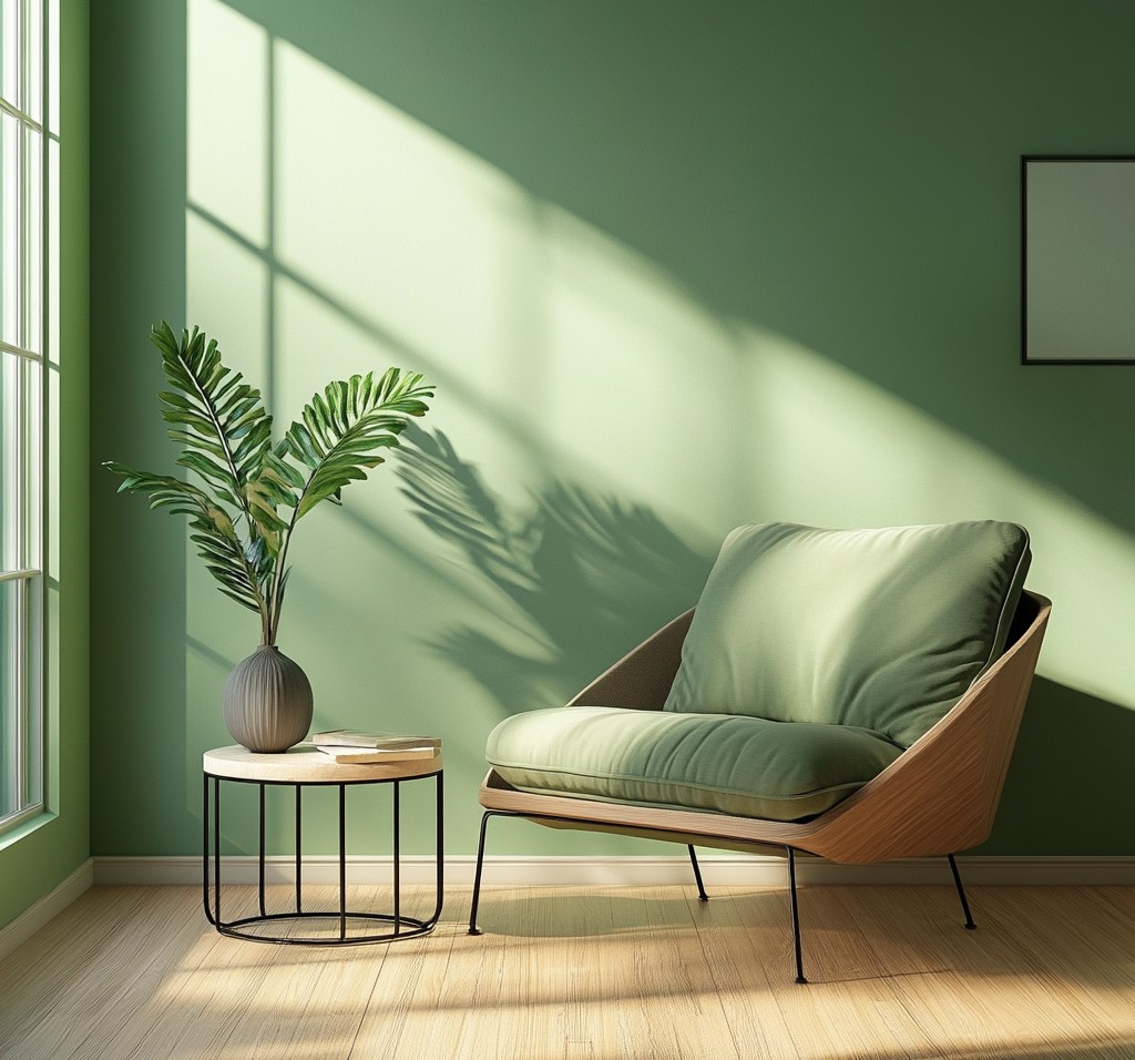
The Great Green Balancing Act
Green sits right in the middle of the color spectrum. Literally. It’s balanced, grounded, and strongly associated with nature. That’s why it’s an excellent choice for spaces where you want to feel restored—like home offices or quiet corners.
Olive tones can lend sophistication, especially when paired with natural wood. Soft sages feel spa-like and airy. Bright, grassy greens? They’re playful, but harder to match well with other decor unless you’re going for a retro or ultra-eclectic style.
Pro tip: If you're trying to fake the feeling of a garden in a room with no windows—green walls plus some good artificial plants might do the trick. Your brain often can’t tell the difference.
Red, Passion, and the Law of Diminishing Returns
Red gets the blood pumping. It’s associated with appetite, excitement, and drama. That’s why restaurants use it (think fast food chains and upscale bistros alike). In small doses, it’s thrilling. But as a wall color? It’s a bit like espresso—great in moderation, overwhelming in excess.
Dining rooms? Maybe. Entryways? Sure. But a bright red bedroom? Unless you’re planning to never sleep again, you might want to reconsider. And if you still crave a touch of red, consider an accent wall or even red accessories—throw pillows, artwork, or a vintage chair can bring the same energy without the overload.
White: The Blank Canvas That’s Not So Blank
White is deceptively complex. On paper, it’s the absence of color. But in real life, it’s full of nuance. There’s warm white, cool white, greige, ivory, eggshell... and every single one casts a different mood depending on your space’s light and texture.
Here’s the trick with white: it works best when it’s not alone. Think layers—textiles, plants, wood tones. Pure white in a space without character can feel sterile or unfinished. But when done right, it offers clarity, openness, and calm. It’s not empty; it’s waiting.
Gray Area: Calm or Gloomy?
Gray had its big moment in the last decade—and it’s still hanging around for a reason. It’s neutral without being boring, modern without being harsh. It provides a stable backdrop for bold furniture and art. But here’s the kicker: gray can shift dramatically depending on your lighting.
Cool grays can feel crisp and architectural—or cold and corporate. Warmer grays (those with brown or taupe undertones) tend to play nicer in homes. Want a color that won’t argue with your couch? Mid-tone gray might be it.
Pinks, Purples, and the Rise of Emotional Design
Not long ago, pink was pigeonholed into nurseries and teen bedrooms. But soft blush tones are now everywhere—from millennial-inspired living rooms to high-end hotel suites. Why? Because pink has evolved. It’s warm, welcoming, and surprisingly adult.
Purples, on the other hand, can be tricky. Lavender? Lovely and fresh. Deep eggplant? Rich, moody, but prone to feeling heavy if not lit well. These colors aren’t “neutral,” but they’re emotionally loaded—and that’s exactly their charm.
So… What’s the Right Mood for Your Room?
There’s no cheat sheet, sadly. What feels calming to one person might feel dull to another. A dramatic charcoal bedroom might soothe one person’s nerves, but keep another wide-eyed at 2 a.m. It’s all about emotional context. The room’s function matters. So do your habits. So does the sunlight, the city you live in, the season, your furniture, your mood.
Ask yourself: How do I want to feel in this space? Energized? Relaxed? Creative? Then work backwards from that. If you're still unsure, try samples—yes, actual paint on the wall. A color chip is a promise; real paint is a reality check.
The Mood Isn't Just on the Wall
Remember, paint isn’t the whole story. Texture, light, furniture, and even the scent of a space all play into how it feels. But the color on your walls? It’s the first thing your eyes register. It’s the atmosphere you live in. So take your time. Choose not just what looks good—but what feels right.
Because at the end of the day (or better yet, the beginning), you don’t just live in a room. You live with it.